How to Use Background Overlay in Elementor for Web Design
Background overlays are a design technique that adds a semi-transparent layer over background images or colors. This enhances visual clarity, improves content readability, and helps maintain design consistency. Elementor, as a feature-rich WordPress page builder, provides comprehensive tools for adding and customizing background overlays.

This guide explains how to use background overlays in Elementor, covering essential concepts, setup steps, advanced techniques, and practical design examples.
Understanding Background Overlays
A background overlay is a semi-transparent layer applied over a background image or color. It enhances the visual impact of a section or element, highlights key content, and ensures overall design harmony.
Key Benefits:
- Improved Readability: Simplifies busy backgrounds to emphasize text or buttons.
- Enhanced Depth: Adds layers and a sense of dimension.
- Design Consistency: Maintains a unified visual style across the site.
Setting Up Background Overlays in Elementor
1. Access the Elementor Editor
- Log in to your WordPress dashboard.
- Open the page you want to edit and click Edit with Elementor.

2. Add or Select a Section
- To start fresh, add a new section by clicking the + button.
- To modify an existing design, select the relevant section or element.
3. Locate Background Settings
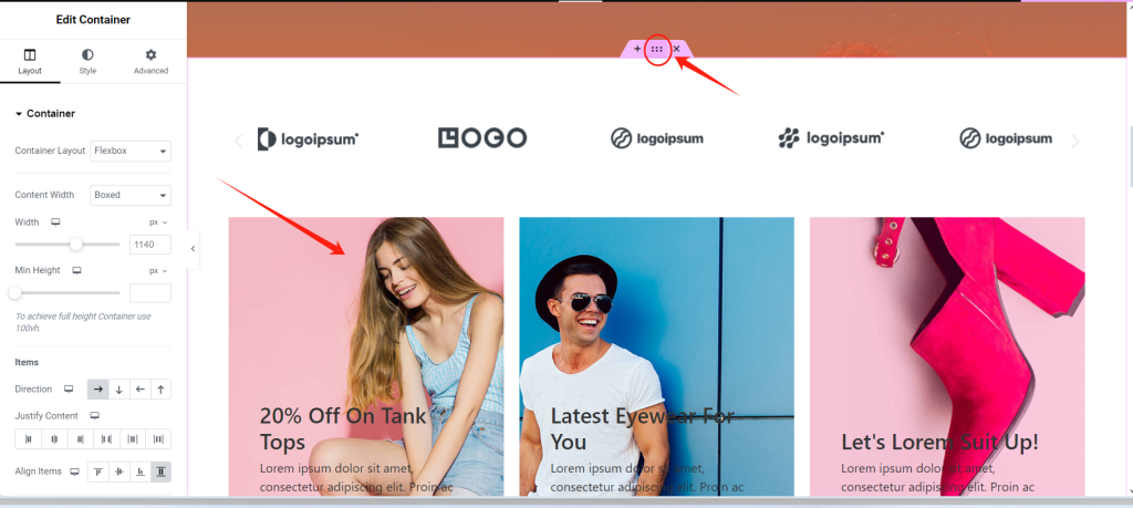
- Click on the section or element to open the left-side settings panel.
- Go to the Style tab to access background and overlay options.
Applying Background Overlays
1. Add a Background
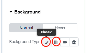
In the Style tab under Background, choose one of the following:
- Classic Background: Set a solid color or static image.
- Gradient Background: Create a smooth transition between two colors.
Example:
For a hero section, upload a high-quality product image as the background and add a dark gradient overlay to highlight text and call-to-action buttons.
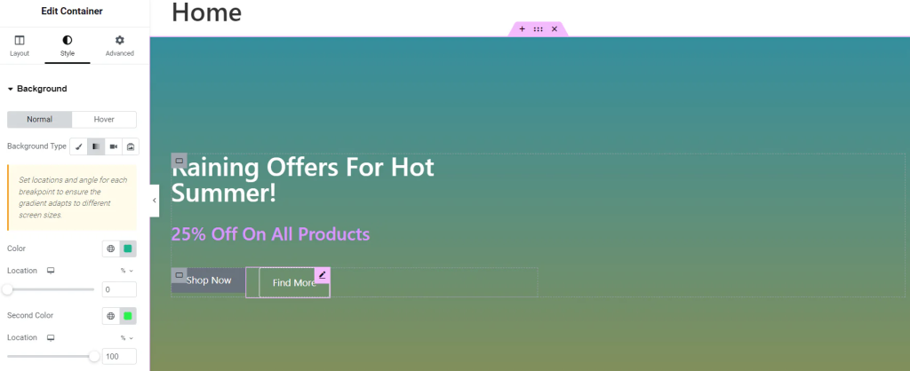
2. Enable Background Overlay
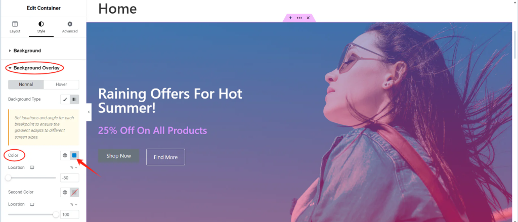
Navigate to the Background Overlay section and configure:
- Overlay Color: Choose a color, such as black, white, or your brand’s primary shade.
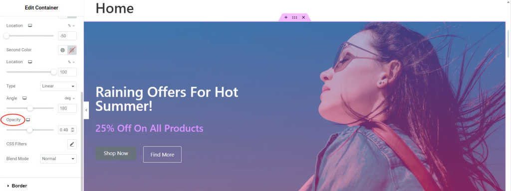
- Opacity: Adjust the transparency to balance the overlay effect.
3. Apply to Specific Elements
Background overlays can be applied not only to sections but also to inner sections and widgets.
Steps for Widgets:
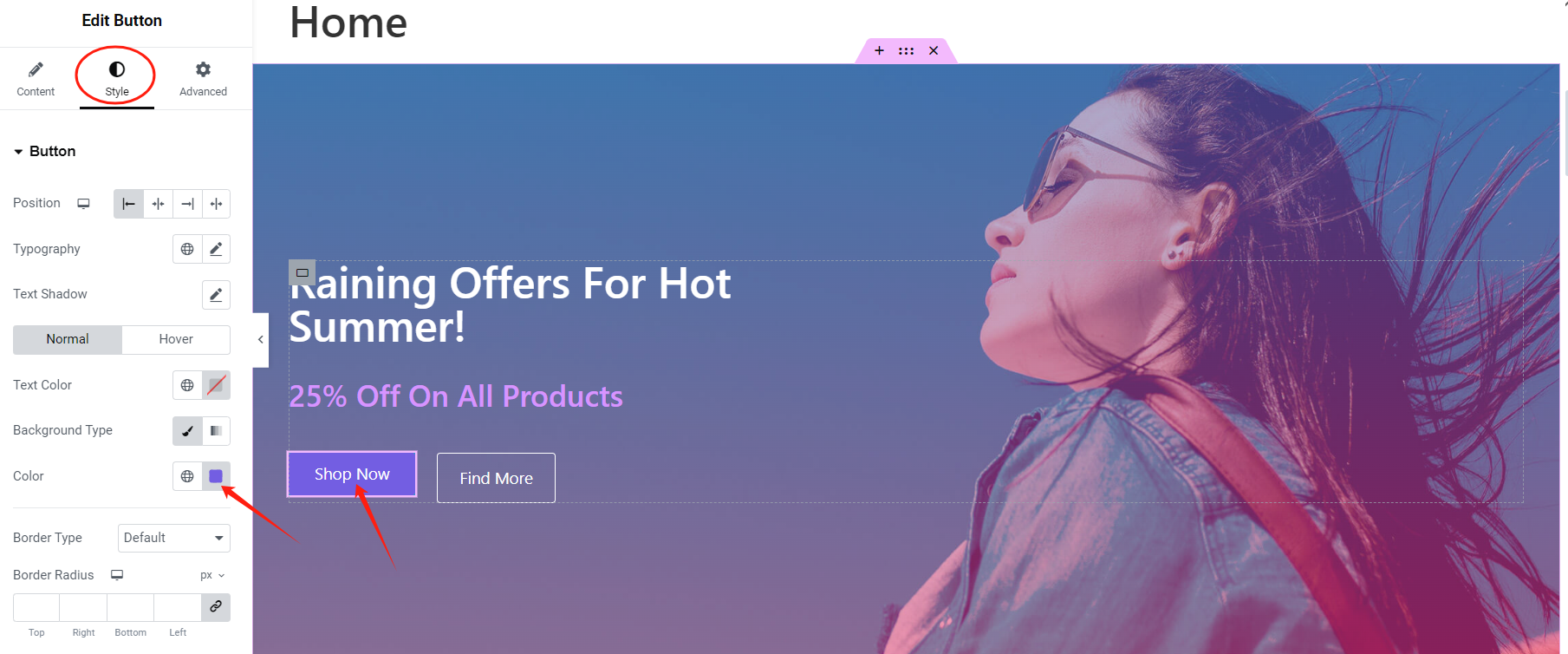
- Select the desired widget, such as an image or button.

- In the Style tab, set up the background.
Advanced Techniques for Background Overlays
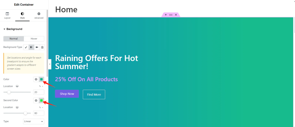
1. Gradient Overlays
Gradient overlays add depth and visual interest. These are suitable for highlighting sections or drawing attention to specific content.
Steps:
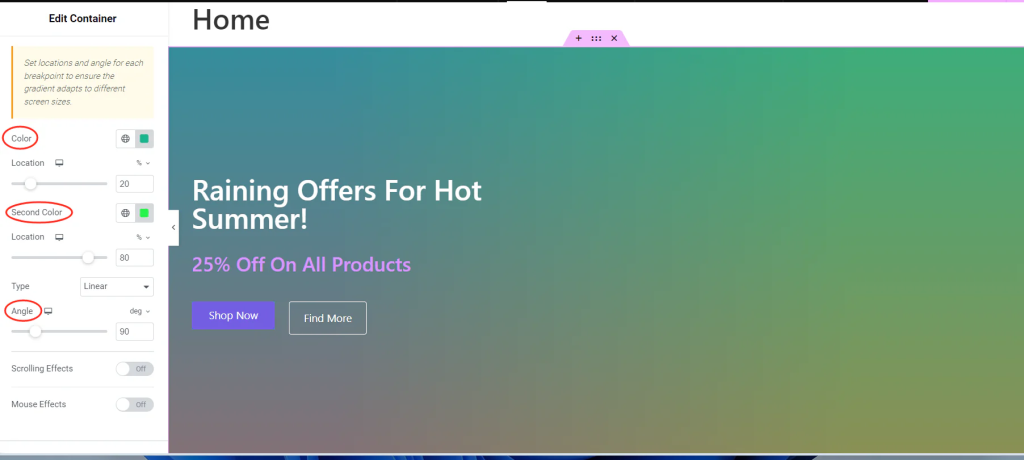
- Select two complementary colors.
- Adjust the gradient angle (e.g., 45° or 90°) and transition range.

2. Adding Hover Effects
Interactive hover effects make overlays more engaging and visually dynamic.
Example: Gradient Transition on Hover
- Initial Setup:
Define the base gradient under the Style > Background Overlay section.
- Hover Effect:
Go to the Hover tab and configure a different gradient for the hover state. The colors will transition smoothly when users hover over the section.
3. Multi-Layered Overlays
Combine multiple overlays for more complex visual effects.
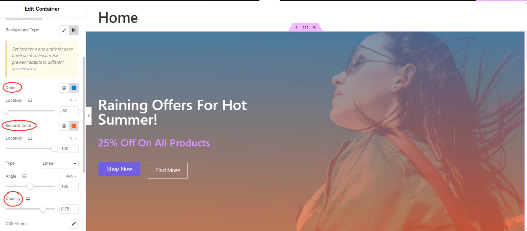
Example: Gradient + Blur Effect
- Set the Background Image:
Upload a high-resolution image under Style > Background. - Add the First Overlay (Gradient):
Configure a gradient under Style > Background Overlay. Adjust the opacity to allow the background image to remain visible.
- Apply a Blur Effect:
Add custom CSS under Advanced > Custom CSS:
selector::after { content: ""; position: absolute; top: 0; left: 0; width: 100%; height: 100%; background: rgba(255, 255, 255, 0.3); backdrop-filter: blur(10px); z-index: 1; }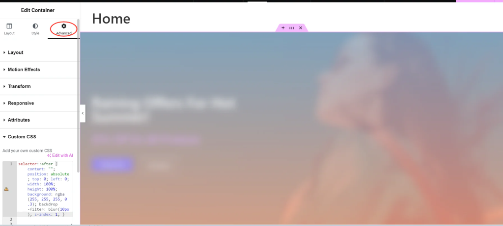
Test these effects on different devices to ensure consistency.
conclude
Background overlays in Elementor are a practical design tool that improves readability, adds depth, and ensures consistency by applying semi-transparent layers over images or colors. This guide explains how to set up overlays, including adding classic or gradient backgrounds, adjusting colors and opacity, and applying them to sections or specific elements. It also covers advanced techniques such as gradient transitions, hover effects, and combining gradients with blur effects for more dynamic designs. These features help create a cohesive and visually appealing website.




Responses