How to Create a Vertical Sticky Sidebar in Elementor for Seamless Page Navigation

A vertical sticky sidebar is a practical design element positioned on the side of the page that remains visible within the viewport as users scroll down. This fixed-position sidebar can be an efficient tool for guiding visitors through your content by allowing quick access to specific page sections. For websites with extensive information, such as service pages, portfolios, or blog posts, a sticky sidebar improves user experience by offering a convenient navigation tool, making it easier for users to jump to desired sections without needing to scroll extensively.

This tutorial will guide you through creating a vertical sticky sidebar in Elementor with navigation items, anchor links, and custom styling to match your website’s aesthetic.
Preparation
Before you start, ensure the following:
- Elementor Pro Installed and Activated: The sticky effect requires Elementor Pro.
- Page Setup: Either a new or existing page where you want to add the vertical sticky sidebar.
- Familiarity with Elementor Containers: We recommend working with Flexbox Container mode for more flexible control for this tutorial.
Step 1: Create a Single Page Template
We’ll begin by creating a single page template and setting it up to house the container that will serve as our vertical sticky sidebar.
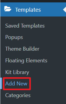
- Navigate to Templates
In your WordPress dashboard, go to Elementor > Templates > Add New.
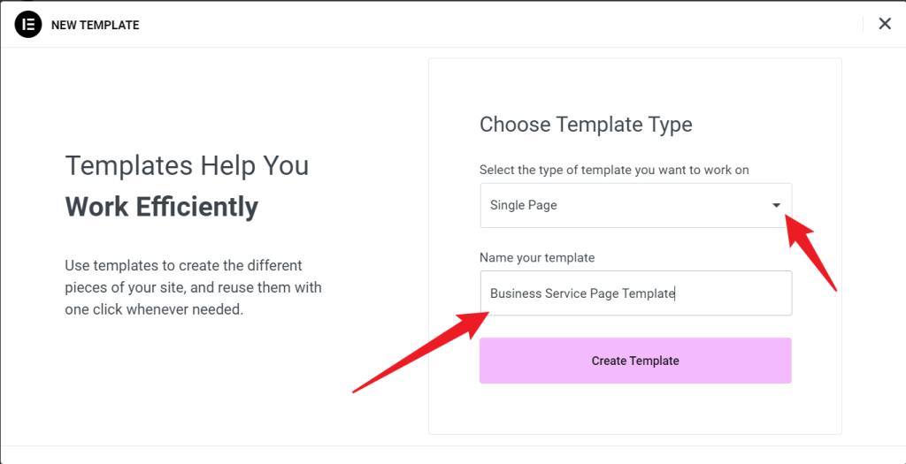
- Select Template Type
In the popup, choose Single Page as the template type and give it a name, like “Business Service Page Template.”
- Choose Page Type
At the top of the template library, select the Pages tab.
Browse the available templates to find a suitable style. You can use the search bar to find templates for specific purposes, such as “Services” or “Company.” If you’re creating this sidebar for a particular type of page, you may also configure conditions in the display settings to limit its appearance to specific pages.
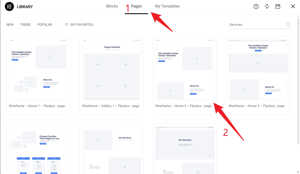
You can choose whether to insert an existing template and if you need to add side sticky navigation to one of your pages, you can edit the page directly.
Step 2: Create the Container in Elementor
This container will serve as the base for the vertical sticky sidebar.
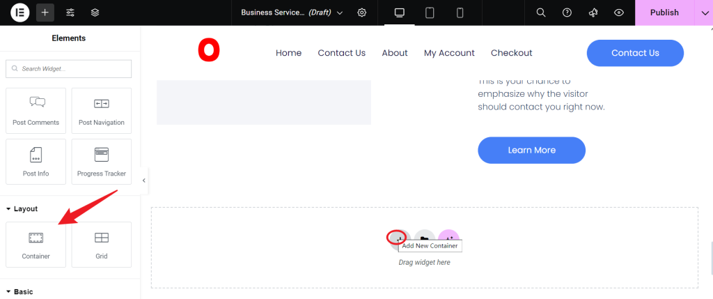
- Add the Container
In the page editor, click Add New Container and drag it into your design area. This container will act as the main structure for the sticky sidebar.
- Set the Container Direction
Select the container, then set its direction to Vertical in the settings panel on the left. A vertical direction allows the sidebar items to stack from top to bottom, which is essential for creating a vertical sidebar layout.

- Define Container Width
In the Style tab, adjust the width to fit the sidebar’s needs, such as 200px or less, depending on your design preferences. Ensuring it takes up minimal space on the page helps maintain focus on the main content.

Step 3: Create the Vertical Sticky Sidebar
- Insert Title and Navigation Items
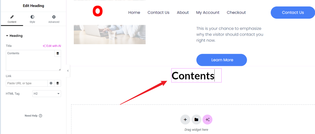
Add a Heading widget inside the container with a title like “Quick Navigation” or “Contents.”
- Add List Items
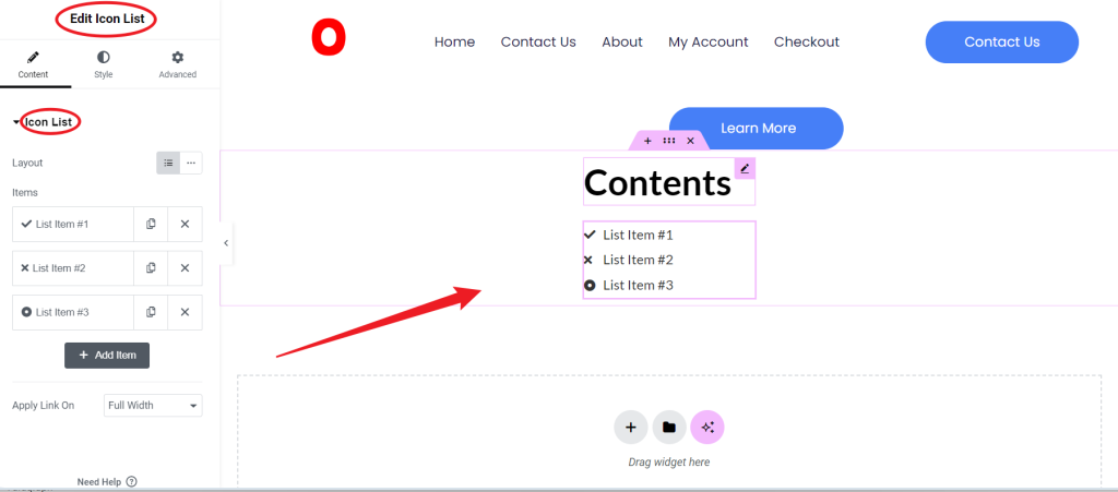
Insert an Icon List or Button widget below the heading to create navigation items. Here, we’ll use an Icon List for a streamlined look, allowing space between each item in the sidebar.
- Add Navigation Links
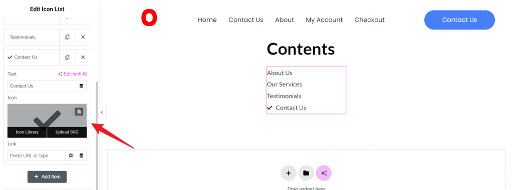
For your sidebar navigation, add items such as:
- About Us: This will link to the company overview.
- Our Services: Directs to the services section.
- Testimonials: Leads to the client feedback area.
- Contact Us: Links to the contact form or information section.

Customize names and icons as desired to reflect your page layout. Delete the icon or go to the icon gallery to select it.
- Set Anchor Links
Add anchor links to each navigation item by setting up anchor points on the page. For example, for an “About Us” section, we’ll use #about-us, and similar anchors for other sections.
Add an Anchor for “About Us”
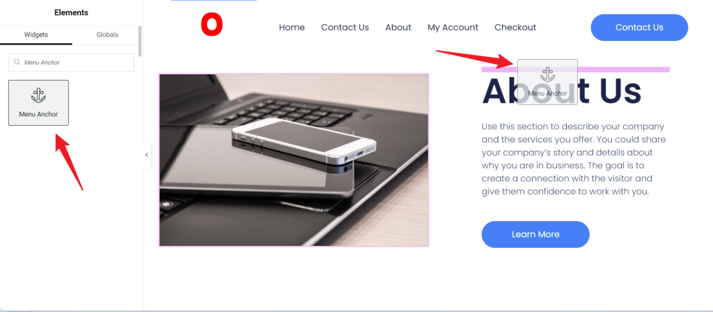
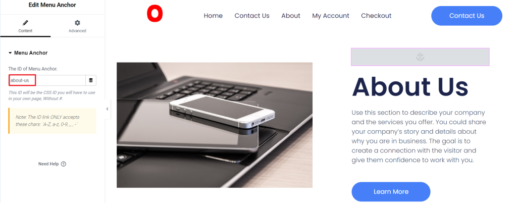
In Elementor, find the Menu Anchor widget. Drag it just above the title for the “About Us” section or to any appropriate position. Name the anchor (for example, about-us) in the settings for easy linking later.
Link the Anchor to Navigation
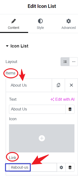
Return to the Icon List item for “About Us” and link it by setting the URL as #about-us. Users clicking on this navigation item will immediately jump to the section.
Repeat this process for the remaining menu items.
- Define Sidebar Width
To maintain a consistent layout, set the width of both the Icon List container and the main container to a fixed value, such as 200px.
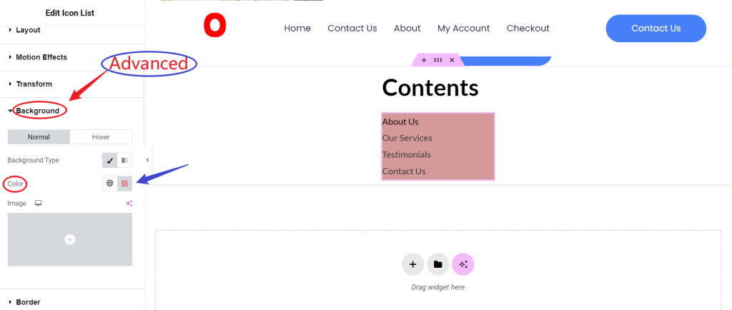
- Customize Sidebar Style
You can adjust the font, colors, and spacing in the Style tab to match your site’s style. You may also add a background color, padding, and shadow effects to make the sidebar visually distinct.
Step 4: Enable Sticky Effect
To keep the sidebar fixed as the user scrolls, follow these steps:
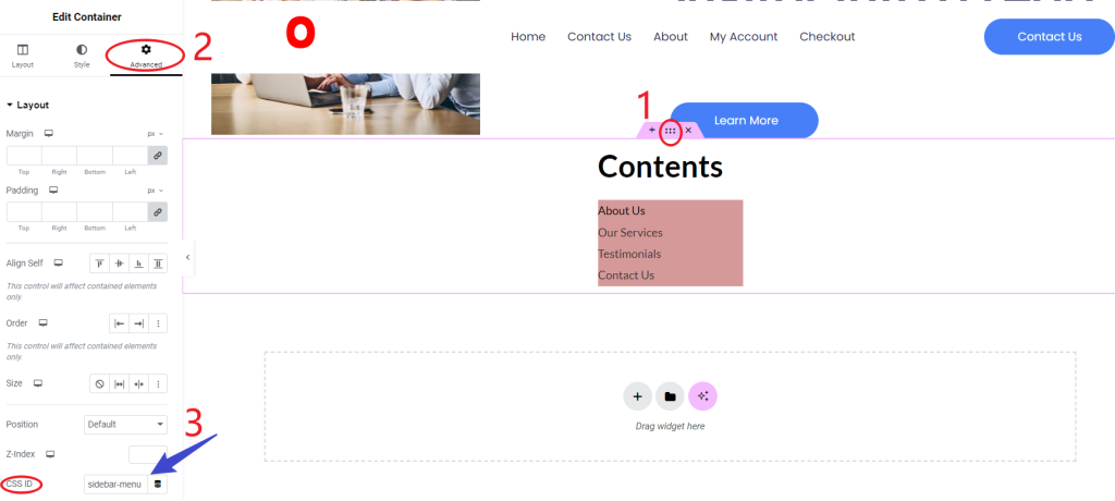
- Setting CSS ID for the navigation bar and content area
Select the navigation bar container, and in the Advanced tab, add a CSS ID; for example, set the ID to the sidebar-menu.
- Adding custom CSS code
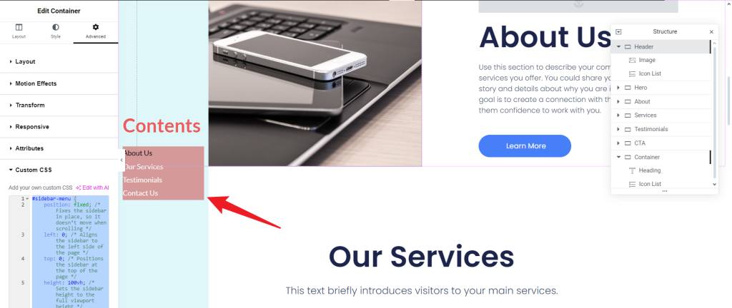
Open Custom CSS in Elementor (a global setting or custom CSS for the navigation bar container). Add the following code:
#sidebar-menu {
    position: fixed; /* Fixes the sidebar in place, so it doesn’t move when scrolling */
    left: 0; /* Aligns the sidebar to the left side of the page */
    top: 0; /* Positions the sidebar at the top of the page */
    height: 100vh; /* Sets the sidebar height to the full viewport height */
    width: 200px; /* Adjusts the width of the sidebar as needed */
    z-index: 10; /* Ensures the sidebar stays on top of other elements */
    background-color: #e0f7fa; /* Sets the background color of the sidebar */
    color: #FFF; /* Sets the text color inside the sidebar */
    padding-top: 250px; /* Adds padding at the top of the sidebar */
    overflow-y: auto; /* Allows scrolling if the sidebar content is too long */
}
Explanation
- position: fixed;
- Keeps the sidebar in a fixed position on the screen as users scroll. It will always remain visible in the viewport regardless of page scrolling.
- left: 0;
- Align the sidebar to the viewport’s left edge, positioning it flush with the page’s left side.
- top: 0;
- This sets the sidebar to start at the top of the viewport, aligning it with the top of the page.
- height: 100vh;
- Sets the sidebar’s height to occupy the entire viewport height (100% of the viewport height). This ensures the sidebar spans from the top to the bottom of the screen.
- width: 200px;
- Sets the sidebar’s width to 200px. This value can be adjusted based on design needs.
- z-index: 10;
- Sets the sidebar’s stacking order. A higher z-index ensures the sidebar appears above other elements that might overlap.
- background-color: #e0f7fa;
- This defines the background color of the sidebar. Here, a light pastel blue (#e0f7fa) has been chosen to give the look of calm and cleanliness.
- color: #FFF;
- Sets the text color within the sidebar to white (#FFF). This provides contrast against the pastel blue background, improving readability.
- padding-top: 250px;
- Adds padding at the top of the sidebar. This can be useful if you want the main content of the sidebar (like navigation links) to start further down, leaving space at the top for branding or logos.
- overflow-y: auto;
- It allows vertical scrolling inside the sidebar if the content exceeds its height. This ensures the content remains accessible without affecting the page’s overall layout.

A vertical sticky sidebar is a design element that remains fixed on the side of a webpage as users scroll, providing quick navigation to specific sections. This tutorial guides you through creating a sticky sidebar in Elementor, using navigation items, anchor links, and custom styling for a seamless user experience. With Elementor Pro installed, you’ll create a single page template, set up a container for the sidebar, add navigation items, and assign anchor links. Finally, by adding custom CSS, the sidebar stays fixed in the viewport, enhancing accessibility on content-heavy pages, such as service or portfolio sections.




Responses